A Bold New Look for OnlineLabels
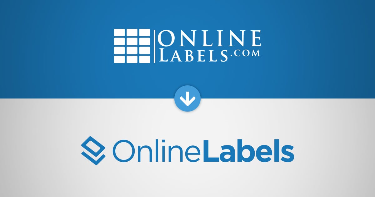
We have exciting news! After almost 20 years, we’ve changed our logo. We’ve modernized the look and feel for a refreshing new representation of our brand and mission.

When our previous logo was introduced, we needed it to represent the only product offered at the time, blank labels on sheets. "The Grid" icon served that function perfectly. The significant expansion of our product line into custom labels and new formats led us to re-evaluate introducing a logo that better represents all that we do.
So, what exactly does this new logo represent?
In addition to the modernized font, the changes include a completely rethought icon that looks less like a label sheet, but embraces our overall expertise in all things labels, wherever they're used.
It represents a label being pulled off of its liner, while simultaneously, a label being applied to a surface.
And if you’re not impressed yet, it's also styled to look like an "O" and an "L"! 😉
Finally, we dropped the dot-com from the logo. Why? While we were born as an "e-commerce company," we’ve become more than that through the years. We’re a technology company that focuses on bringing the best label products to market, at the highest quality, with the best experience.
What This Means for You
We’re still the same brand you know and trust, just with a logo that better suits our mission and goal for our customers. We’ve loved being there for you and your business for the past 25 years, and we’re excited to continue growing together!


