How To Create Eye-Catching Labels Using Complementary Colors

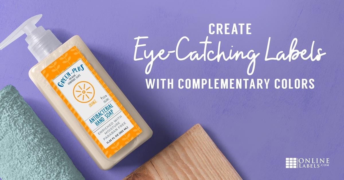
Designing a label that catches attention isn’t as easy as it may seem. Selecting colors is more than just picking what fits your brand or what looks "pretty." To understand what colors work best together and why, let’s dive into the basics of color theory.
Primary & Secondary Colors
You've probably learned this when you were young, but a refresher never hurts — the primary colors are red, yellow, and blue. The secondary colors are purple, orange, and green. These two color sets are highly contrasting to each other which creates a strong aesthetic impact.
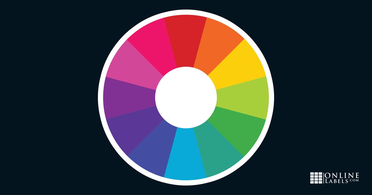
Complementary Colors
Complementary colors are on opposite ends of the color wheel from each other. Since these colors oppose each other, they have the effect of making each other pop. Red is complementary to green, yellow is complementary to purple, and blue is complementary to orange. Complementary colors complete each other. Can you think of anything that uses complementary colors? (Hint: Christmas is one!)
Split Complementary
Split complementary colors are similar to complementary colors, but offer you a little more variation. Instead of two perfectly opposing colors, split complementary colors use a "split color" where one of the colors is split on either side of the color wheel.
For example, instead of purple and yellow (complementary colors), you can group purple, yellow-orange, and yellow-green. This creates a split complementary color group using yellow as the split color. Split complementary colors have the same visual impact while giving you a little more flexibility in your design elements.
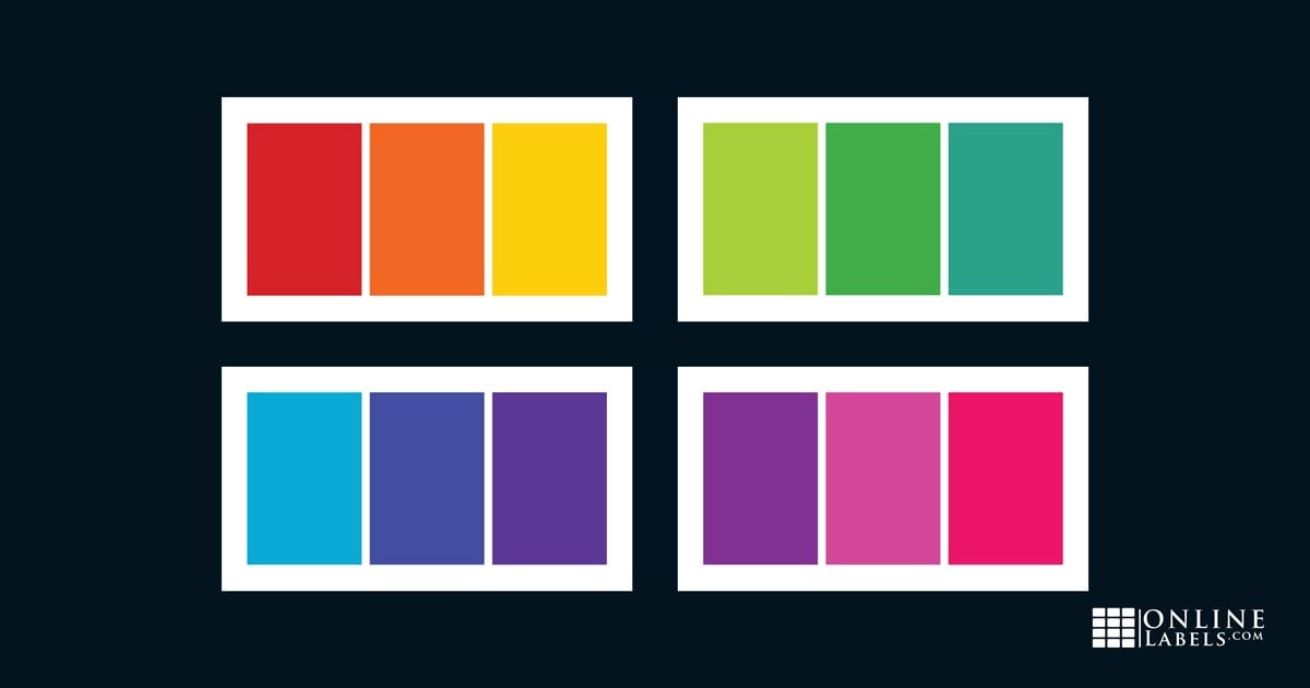
Analogous Colors
Analogous colors are colors that are near each other on the color wheel. Some examples of analogous colors are:
- Yellow-green, green, and blue-green
- Orange, red-orange, and red
These colors work together to form a pallet that’s intriguing and soothing. Analogous colors are easy on the eyes and while they may not "pop" alongside each other, the way they work together has a different yet equally pleasing visual impact. (Think of fall leaves!)
Monochromatic
Along the same lines, you could choose a monochromatic color scheme. Monochromatic schemes rely on the shades of one color. It may seem like using just one color means a boring and flat design, but taking this approach can actually be aesthetically pleasing by producing a visual "vibe" ranging from classic to edgy depending on your base color.
Color Psychology
Speaking of "vibes," the colors you choose say more than you may realize. For example, red, yellow, and blue used together are considered playful and vibrant. For this reason, they’re commonly used for children’s toys. Green is typically associated with nature, so it’s often used for earth-friendly products and brands. The more you know about color psychology, the better armed you are to select colors that represent your design goal or intended perception.
To learn more about how colors are perceived and selected, check out How to Create the Best Labels and Packaging Using Color Psychology.
Pair Text & Background Colors
The last piece of the puzzle — choosing legible color combinations for your text and background. Like we covered earlier, the guiding principle here is contrast. The greater the contrast, the greater the clarity of your text. Increased contrast minimizes eye strain and results in a more pleasing design.
The goal is to pair text and background colors that have a large amount of contrast in both color and shade. An easy method for selecting your text and background colors is using complementary colors. By pairing a dark color from the bottom half of the color wheel with a light one from the top, you get a pair of colors that will pop against each other for clear, legible text.
I hope you feel armed with a little extra information on color theory and ready to tackle your next batch of label designs! For more design tips, check out How To Design Perfect Product Labels and How To Create Visual Hierarchy in Your Product Label Design.
Find Inspiration!
If you're looking for inspiration for designing with complementary colors, look no further than our Customer Ideas section. It's filled with creative examples that demonstrate the power of pairing complementary colors to create eye-catching designs.
Mother’s Earth’s Natural Remedy
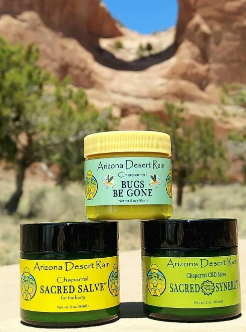
Details: OL1437 Weatherproof Gloss for Inkjet Printers
Honey-Kiss Lip Balm
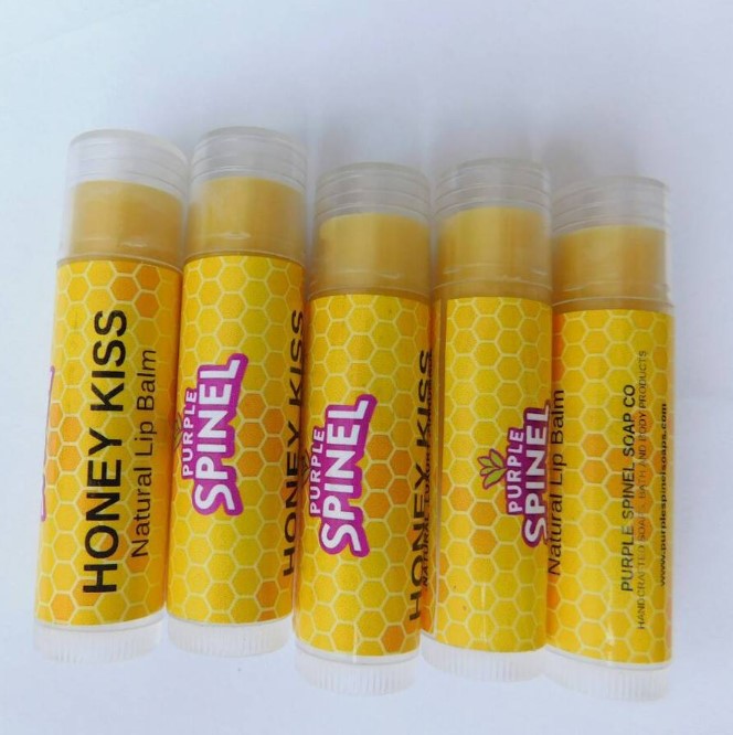
Details: OL177WI Weatherproof Gloss for Inkjet Printer
Ethiopia Coffe Bag
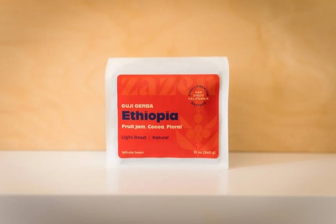
Details: OL150WX Standard White Matte
Start designing your labels using our design software, Maestro Label Designer, or visit our Customer Ideas Gallery for more design inspiration.
Have labels ready to print? Order them custom printed on rolls or sheets today.