How to Set Up Print-Ready Label Artwork for Custom Printing

You worked hard designing the perfect label, the last thing you want is to pick up the finished product only to see a blurry image or pixelated graphic. Help is here! Follow the instructions and helpful hints below for high-resolution, high-quality custom printed labels.
Custom Printing Artwork Setup Overview
We recommend making a checklist of each of the following items. Review your label artwork for each of these before submitting your custom printed label order.
- Resolution is at least 300 dpi
- Bleed extends at least 1/8" past label outline
- Safe margin is observed
- Color palette is CMYK*
- File type is .ai, .eps, .png, .jpg, .jpeg, .gif, or .pdf
- File size is no larger than 40 MB
- Fonts are at least 6 point size and easy to read
- Borders are at least 0.5 points
- Graphics are embedded (not linked)
- Label outlines have been removed
- Material color is a part of your design considerations
- Proofing has been completed
How should I set my label artwork resolution?

Blurry or pixelated images can happen when you overly enlarge a file or if you start with a low-quality image from the internet. While your photos and graphics may appear fine on-screen, the final printed product likely will not. This is because web-based images typically range from 72-96 dpi whereas print images require 300 dpi or greater for clarity.
To check the resolution of your existing image, complete the following steps:
- Save the file to your computer
- Right-click on the icon and select "Properties"
- Switch to the "Details" tab
- Look to the lines for "Horizontal/Vertical resolution"
Here are a few suggestions for fixing low resolution imagery:
- Reupload your image to see if it was compressed during the process
- Find a higher resolution version online (stock photo libraries are a great resource)
- Use photo editing software
- Reduce the size of the graphic on your label
If all else fails, you may want to consider removing the low-resolution element.
What is "bleed" on label artwork?
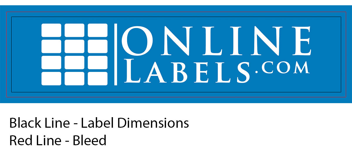
"Bleed" is when you allow your design to transcend the dimensions of the label. It ensures that your design reaches the edge of the label once it's peeled up from the liner. This is important because it accounts for any shifting that may occur throughout the printing process.
Here are a few suggestions for adding bleed in any design program:
- Stretch your design beyond the label dieline (outline)
- Add a thick border
- Set a background color across the entire sheet
Learn how to add a bleed using Maestro Label Designer.
How To Add Safe Margin to a Label Design
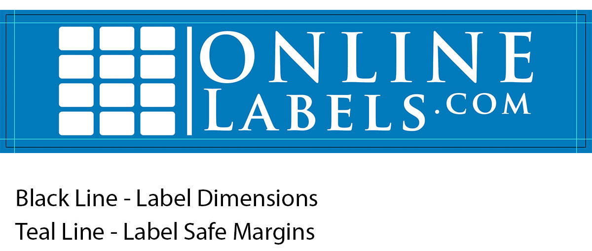
Also called the safe zone, this is the area within 0.125" of the label dieline (outline). It's there to ensure no valuable part of your design ends gets cut off. This is important because it accounts for any shifting that may occur throughout the printing process.
To observe the safe zone, pull your design inward toward the center of the label. This includes keeping text, design elements, and more away from the edge. We recommend at least 1/8" or 1/16" of space between your design and the outline of your label.
What color setting should I use for my design?
Consider how the colors in your design might look once they're printed. Because colors on-screen display in RGB and printers use CMYK colors, you may notice a loss of vibrancy or slight shifts in color.
This can be especially noticeable with the color black, the printed version can appear more gray. To ensure the blacks in your file print dark enough, use rich black. The CMYK values for rich black are: C=75, M=68, Y=67, K=90. To create a rich black in Maestro Label Designer, use the HEX code 000000.
What's the best file type for custom printing labels?
To build or layout your design in Maestro Label Designer, you can upload the following file types: .jpg, .jpeg, .gif. .png, or .pdf.
For uploading your completed design to the custom printed label tool, your file should be one of the following: .ai, .eps, .png, .jpg, .jpeg, .gif, or .pdf.
Is there a recommended file size for artwork upload?
Maestro Label Designer can accept uploads up to 3 MB in size during the design process.
If you're uploading a completed design to be custom printed, your file should not exceed 40 MB.
How do I optimize fonts for label printing?
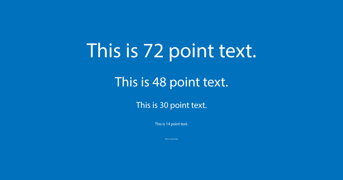
Effective labels should be easy to read. Use caution when choosing your font choice, text size, and type color – they can have a large impact on the end result.
Here are a few tips for effortlessly legible labels:
- Use large font sizes (no smaller than 6 pt)
- Be careful with extremely thin fonts
- Avoid overly curly or decorative typefaces
- Switch to high-contrast color combinations
- Reduce the amount of text (paragraphs of text can feel overwhelming and blend together)
It's also important to remember the actual size of your label. Designs can look much bigger on screen than their printed counterparts. You may want to print your design on regular paper to test it out. Hold the sheet at arm's length and see if you can read your labels.
How should I set borders on my artwork?
With thin borders, any shifting during printing can be highly noticeable. We recommend a minimum of 0.5 for the line/stroke width, though the thicker the better. Bold borders mask any printer shifts and help maintain the integrity of your design.
Double Check the File Location of Your Graphics
If you're working in a design program, it's important to check the location of your photos and graphics. If graphics are linked, we won't be able to access your full label design. For best results, flatten your layers into a single background layer. This includes converting/preserving fonts (learn more).
Caution: Flattening your files means you can no longer make changes to individual layers. Be sure not to save over the original version when flattening.
Make Sure You Remove Outlines From Your Blank Templates
If you used a label template to create your design, make sure to go back in and delete it before printing or uploading your artwork. Should any shifting occur, the label outlines will be a dead giveaway and take away from your design.
Dielines are not the only things you may want to remove. Check that crop marks, registration marks, and the color scale are also removed from your final file.
How will designs print on clear and kraft labels?
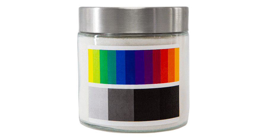
If you're using clear labels, consider how the background might affect the visibility of your design and the accuracy of your color palette. The transparency can play a huge factor in how your final product comes out.
Similar rules apply for our collection of color labels. If you're using a brown kraft or gold label, shown above, the material will show through some of the colors in your design.
If you're ordering your printed labels on rolls, we'll print a while underlay on your design. This will make your prints completely opaque so you don't have to worry about transparency in your prints. Watch the video below to learn how to set up your artwork for custom printing.
Double and Triple Check Your Label Artwork!
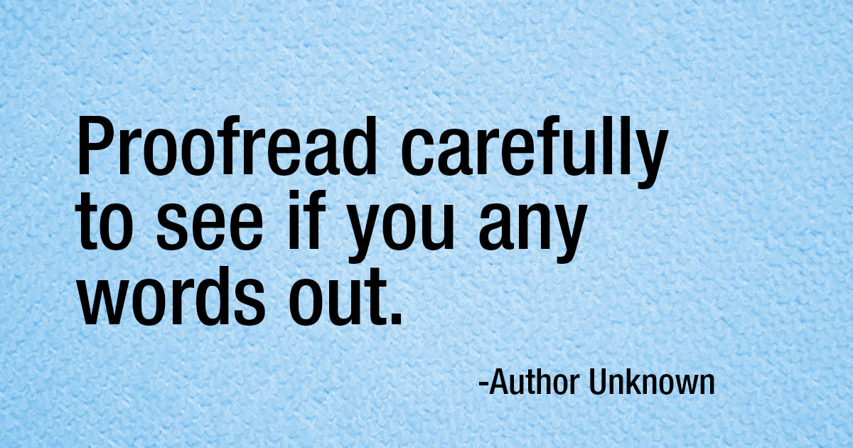
Always check the spelling, layout, and more in your document before hitting print or submit.
Watch out for some of these common copy mistakes while proofreading:
- Basic spelling and grammar. Carefully read over your label, and take advantage of spell and grammar check. If you’re unsure of a grammar rule and it’s too complicated to look up, it may be best to reword the sentence completely.
- Sentence structure and punctuation. Make sure your periods, commas, semicolons and other punctuation marks are all in the correct spots. If you notice a lot of commas and conjunctions, that could be a sign that your sentences are run-ons. Try to use shorter, stand-alone sentences.
- Consistency. You should do one passover focusing on each of these categories, looking for inconsistencies throughout your label: contractions, verb tenses, numbers, and symbols. For example, using % in one place then spelling out "percent" in another.
- Layout. Look at your artwork as a whole and evaluate how it looks. Look at margins, white space, text size, and clashing fonts.
- Tone / Voice. Read through your artwork out loud and make sure it captures the voice of your brand.
- Overall flow. Read through your artwork slowly out loud. This will help you see that everything flows together logically. While you’re at it, make sure it captures the voice of your brand.
Our image quality guide is designed to take the guesswork out of designing and printing your labels. If you're still unsure if your artwork is correct for printing, don't worry! Our print team reviews every order before printing. We'll check for many of these points and let you know if something requires your attention. Once we get your final approval, your order will be printed and shipped!
For more questions related to image uploads in Maestro Label Designer or our custom printed label service, reach out to our customer service team at 1-888-575-2235 or submit a support ticket.
Be sure to share your labels in our Customer Ideas gallery when you're done and share any of your helpful tricks in our forums.