How to Choose the Perfect Font for Your Product Label

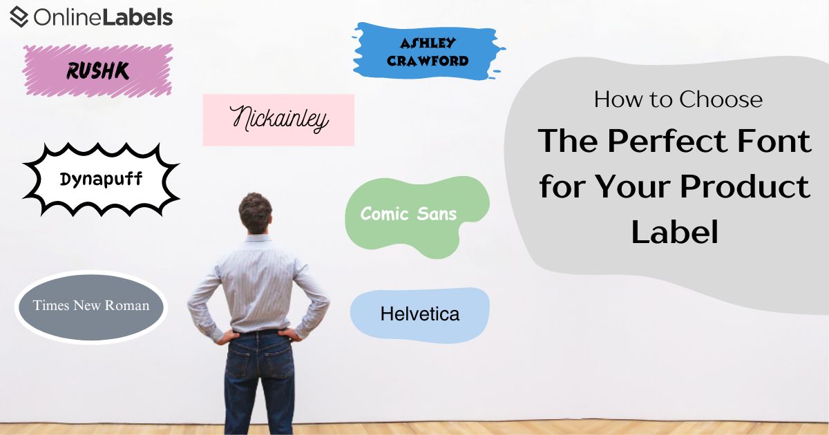
Choosing the right font for a product label is essential to defining a company's brand and attracting a substantial audience. This article will discuss the most critical factors when choosing a font to achieve functionality and brand alignment.
What to Consider When Picking a Font
There are several elements to remember every time you choose a font. Make it a habit to ask yourself these questions:
What is my brand identity?
First, identify what your brand represents—does it embody luxury, playfulness, or a modern feel? Your font should reflect these traits. For instance, luxury brands might lean towards serif fonts to convey elegance, while playful brands could benefit from more rounded, vibrant fonts.
Your font can help convey your brand identity by:
- Evoking Feelings: a rigid and angular font might convey emotions of strength, while a softer font might convey a casual and romantic feeling.
- Psychographics: fonts can evoke value that aligns with a product's target audience. For example, an eco-friendly product with brown kraft labels may use a rustic font to evoke a natural look.

Is this font easy for customers to read?
A font's primary role on a label is to convey information effectively. Choose fonts that are readable in various sizes and from different distances. Sans-serif fonts are generally easier to read, making them a popular choice for ensuring the text is legible at a glance. However, a serif font may be easier for customers to read for larger bodies of text at smaller sizes.
Some aspects of a logo that are enhanced with the correct font include:
- Clear brand communication: legible fonts ensure a brand's message is communicated clearly to the audience. When text is readable, it reduces the risk of misinterpretation and helps audiences relate more to the brand.
- Better brand consistency: the correct font helps a logo or message remain consistent across all marketing materials.
- Reduced cognitive load: legible fonts lessen the cognitive load on the audience and ease the information process during reading. This allows for more knowledge retention and an easier understanding of the message.
Different Font Variations and Color Compatibility
Font Variations
Select a font family with various weights and styles (e.g., bold, semi-bold, light). This flexibility allows for better design hierarchy, enabling you to highlight certain text over others—such as bold for product names, light for ingredient lists, etc.
For instance, using bold fonts for product names can immediately draw the audience's attention to the text. Similarly, lighter weights can be used for secondary information, such as ingredient lists or detailed descriptions, ensuring that these elements are readable.
Color Compatibility
Ensure your font color contrasts well with the background for visibility. Test the font in various color combinations to guarantee it remains clear and vibrant against different backgrounds. A bold, modern sans-serif font might complement vibrant, saturated colors, creating a striking and harmonious look.
On the other hand, the font's weight can also impact how the title interacts with the background color. Light fonts, for example, should be used against a highly contrasted background so they're easier to read.
Consider Custom Fonts
For a unique identity, consider investing in a custom font tailored to your brand. This can greatly distinguish your products from competitors, but remember that custom fonts can be costly.
Conduct Real-World Testing When Choosing a Font
Before finalizing your font choice, test the font on your product label mock-ups. Print them out to see how they translate from digital to physical form. This step confirms the font's effectiveness on products and gives you a final look at the future of your marketing materials.
Fonts are More Than Nice Visuals
Selecting the right font for your product label is more than just an aesthetic decision—it's a strategic move that can significantly impact your brand's perception and consumer engagement.
Here are the key takeaways to ensure your font choice enhances your label's effectiveness:
- Reflect your brand identity: choose a font that embodies your brand's character and values, whether it evokes sophistication, playfulness, or modernity.
- Legibility is vital: choose a font that is easily read in various sizes and distances.
- Unique fonts for a distinctive identity: consider custom fonts to stand out in the marketplace.
- Check font licensing: always confirm that your chosen font is legally permissible for commercial use to avoid legal complications.
- Test, test, test: finally, trial your font in real-world scenarios to confirm its effectiveness on actual product labels (and to make sure you love how it looks).
By carefully considering these points, you can choose a font that looks good, strengthens your brand, and communicates effectively with your target audience.
The Perfect Font Complements the Perfect Product
Choosing the perfect font for your product label is more than a mere design choice; it's a strategic decision that can profoundly impact your brand's perception and consumer engagement. By understanding and prioritizing elements such as brand identity, legibility, font variations, and color compatibility, you can create a product label that looks appealing and effectively communicates your brand's message and values.
Ready to design your labels? Check out Maestro Label Designer, which offers hundreds of free templates and fonts for creating the perfect product label!