8 Common Mistakes to Avoid When Designing Stickers
Custom stickers are a versatile and cost-effective tool that your business can use to increase brand recognition, promote products/services, and engage with customers.
By avoiding a few common errors, you can produce a professional-looking sticker that accurately represents your brand and effectively communicates your message.
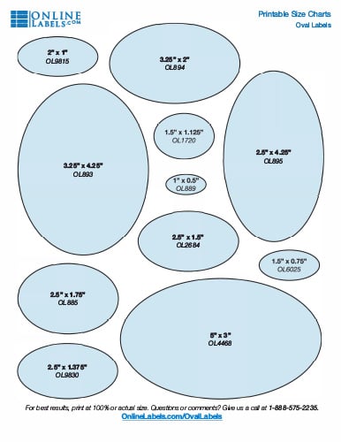
Choosing the Wrong Sticker Size or Shape
When designing stickers for product packaging, it's crucial to ensure your stickers are a good size and shape. Stickers that are too small can be hard to read, while stickers that are too large can be impractical.
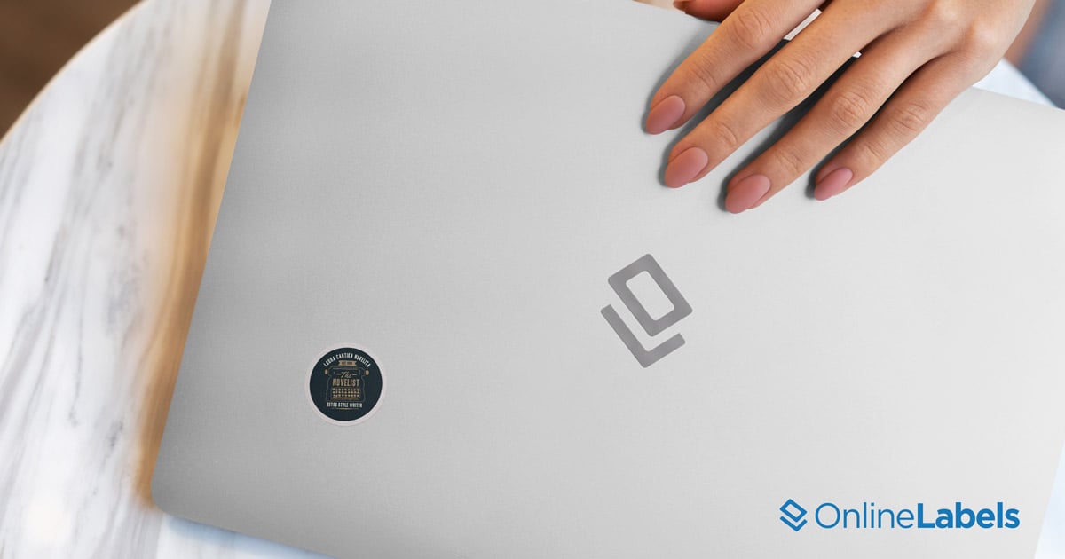
To avoid this, think about the purpose of the sticker. Are you giving these away to customers and fans? Maybe gather together some items your customers would likely put stickers on. Think: reusable water bottles, laptops, a desk, folders and binders. Measure how big you think the ideal size would be for these or other popular sticker surfaces, and go from there! Stickers for this use would likely be a medium size.
Will the stickers be placed in planners and journals? Go for a smaller size. Are the stickers going to be placed in a public place, like a sticker wall or shop window? You may want to go slightly larger.
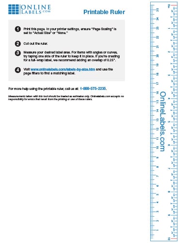
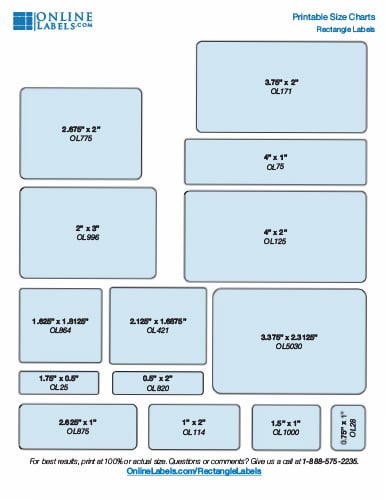
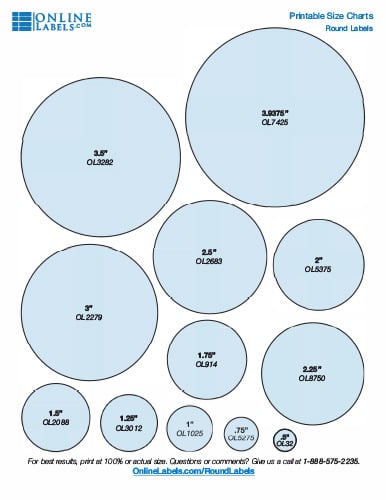
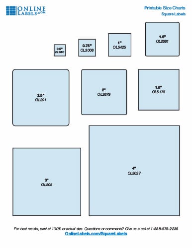
If you don't have a ruler handy, use our free printable ruler or printable size guides to reference different sizes for your application.
Not Staying On-Brand With Your Stickers
To make sure your custom stickers represent your brand, coordinate the design and colors with your message and any other branding material you’ve created. To assist with this, you can use a color wheel to select one to three colors that complement your brand.
When using a color wheel, keep in mind, opposite colors are complementary while adjacent colors create harmony. Colors separated by three positions are harmonious but not as strong.
Not Following Our Artwork Upload Guidelines
To avoid blurry or pixelated graphics in your custom stickers, it's essential that you upload the highest resolution possible. To ensure beautiful printed custom stickers, make sure:
- Artwork size is the same as your desired label size
- Resolution is at least 300 dpi
- Unprinted area is observed
- Color palette is CMYK
- File type is .ai, .eps, .png, .jpg, .jpeg, .gif, or .pdf
Check out our artwork guidelines article for more tips on setting up custom sticker orders for success.
Using Small or Hard-To-Read Fonts on Your Stickers
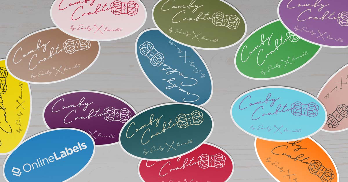
The text on your custom sticker must be legible, regardless of size. If customers can’t read your sticker, it’s ultimately useless in representing your brand. Avoid using fancy script or cursive fonts that may not print well, and verify that the font size is at least 6 points. Your goal is clarity, so make sure the text is large enough to actually read.
Sticker Information Overload
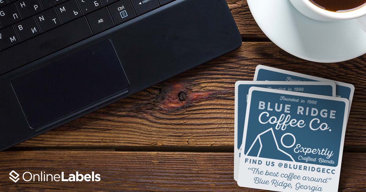
To avoid cluttered stickers, include white space or spacing between elements to create an organized and aesthetically pleasing design. This not only helps with readability but also improves the customer's impression of your brand. Adding white space can “level-up” your branding by making it feel more modern.
Keep your sticker impactful and eye-catching by ensuring only key information is displayed. If you catch a new customer’s interest, the goal is that they’ll use the information on the sticker to look up the business and learn more, so you don’t want to overwhelm them at the get-go.
Not Proofreading Your Stickers
Spelling mistakes immediately reduce your brand’s credibility. To ensure there are no spelling or grammar errors, it's important to proof your sticker design before placing an order. Once you’ve completed your final review, ask someone else to review your design, too.
When you work on something for a while, mistakes can easily be overlooked. A second or even third pair of eyes can help catch any errors that may have been missed. Once any necessary corrections have been made, check your design one last time before submitting your order.
Choosing the Wrong Adhesive for Your Stickers
Your sticker may appear great initially, but it may not withstand regular use due to various factors. Examples could include the sticker peeling off when wet or after being moved many times. Make sure you use the right adhesive for your product to avoid similar issues.
Adhesives can come in three classifications: permanent, removable, and repositionable. If you need stickers for use in different conditions, a permanent adhesive is the right choice. If you need stickers that can be moved around from one surface to another, using a repositioning adhesive is the ideal option.
OnlineLabels uses white polyester material to create high-quality custom stickers. The material is highly durable, tear-resistant, and made to withstand direct contact with liquids and moisture.
Not Printing a Sticker Sample
It's important to keep in mind that the design you see on your computer screen may differ from the printed version. The colors and fonts you use may print out a bit differently, which is why it's crucial to print a sample of your sticker. Printing a sample allows you to see how it will look when printed at the actual size, and enables you to make any adjustments before ordering or printing a full batch of stickers you may be unhappy with.
We hope this article was helpful and that you avoid these mistakes when designing custom stickers!
Ready to order? Shop custom stickers today.


