How To Create Visual Hierarchy in Your Product Label Design

If you’ve ever taken a design class, you’ve heard the term, "visual hierarchy" — every good design has one, whether it’s an advertisement, movie poster, webpage, magazine page, product label, or other form of visual art.
In this article, we’ll go over what visual hierarchy is and what it entails, how to use it in your designs, and why it’s important to use it in your product labels.
So, what’s a visual hierarchy?
Visual hierarchy is the principle of strategically arranging design elements in a way that guides the viewer’s attention through the art in a natural flow. In a visual hierarchy, some elements will stand out more than others, indicating a hierarchy of importance. The viewer’s eyes will be drawn to the key pieces of information in the design, leading them to desired action in the end.
Understanding people’s natural eye patterns when processing information is vital for creating a visual hierarchy and knowing where to place elements and information. The two main eye patterns to consider are:
- The Z pattern which, you guessed it, follows the shape of a ‘Z’. The viewer’s eyes start at the top left and move horizontally to the right, then down across to the bottom left corner, and over once again to the right. People tend to follow this eye pattern when the design isn’t very dense and doesn’t have a lot of text.
- The F pattern which follows an ‘F’ shape. Viewer’s eyes start at the top left, move horizontally toward the right, then scan down the page on the left, looking for subheads to scan. This eye pattern is more likely followed when the design contains a lot of text.
Your designs don’t always need to follow one of these patterns — just think about where your viewer’s eyes will go initially, where they’ll go second, and where they’ll end up.
Using Visual Hierarchy in Your Design
Size
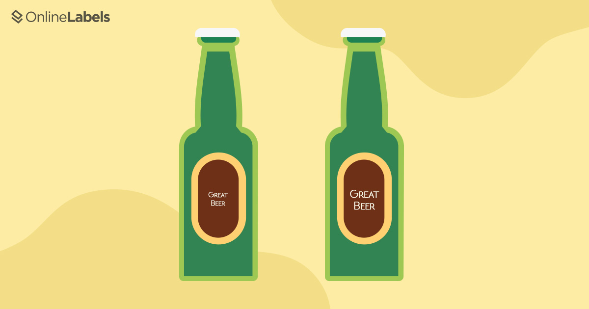
This one is pretty self-explanatory. Making one or multiple element(s) larger than the rest, and thus more eye-catching, will signify importance. Although, scale elements up with caution. Making an element too large can overwhelm the design, or not making important information large enough compared to other elements can cause it to get lost.
Try ordering the elements of your design from most important to least important, and sizing them accordingly.
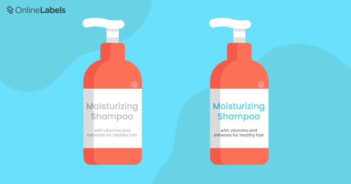
Color and Contrast
Another effective way to guide the attention of your viewer is by using color to create a contrast and grab attention. Similar to size, you want to use caution when playing with color in your design. Too much color can be overwhelming and have a negative impact, so just remember to use it with a purpose in mind.
Here are some ways you can use color to create a visual hierarchy:
- Saturation: Saturation refers to the intensity of color in an image. Using bright, saturated colors for important elements against more muted, desaturated colors can really help to draw the attention to the more significant pieces of information or design.
- Value: Value refers to the lightness or darkness of a color. Colors of different values can be used together to create a contrast, whereas colors with the same or similar values will have an equal weight in your design. If the background, or majority of elements in your design are dark, your viewer’s eyes will naturally be drawn to the element that is lighter in value, and vice versa.
- Temperature: Temperature is defined as the warmth or coolness of a color. Warm colors include most reds, oranges, and yellows, and cool colors include most blues and greens. Colors like black, white, gray, and sometimes brown and beige, are typically classified as neutral colors. Combining colors with different temperatures creates visual interest and can help to guide your viewer’s eyes through the art. You can also strategically use colors with the same temperature to make your design look more unified.
Another way to create contrast is to use cold-foil stamping! This gives your labels metallic details in specified locations, which is helpful for attracting eyes to important elements of the design.
Text Structure
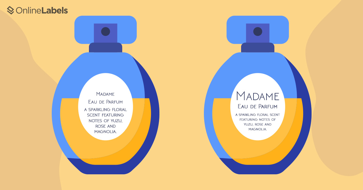
If your design contains text, creating a visual hierarchy is essential. Your text is how you communicate information and prompt your viewer to take action, so you want to be strategic about text structure. Try following the basic three-level approach:
- Level one: Headings. This is the most important information and should be the most noticeable.
- Level two: Subheadings. Level two text shouldn’t be as noticeable as level one text, but is used to further guide your viewer through the information, and group different parts of the content together.
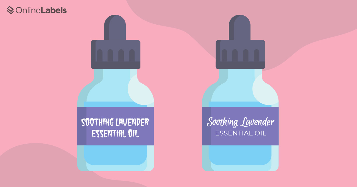
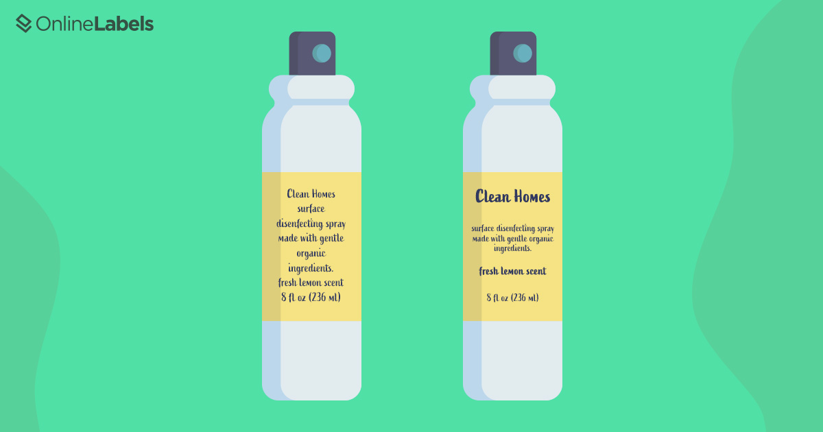
- Level three: Body copy. For a design with dense text, your level three text will contain the details of your message. Level three text isn’t exclusive to text-heavy designs — it can be long or short, so you can absolutely use it in less dense designs. While this is the lowest level of importance in this text structure approach, beware not to make the text size too small — you still want it to be easily readable.
Fonts
Typography — Choosing a font that looks cohesive with your design, and combining fonts — is an art and takes practice to know which fonts will look good together and which will clash, and how to pick a font that supports your message. It can be difficult to figure out when you consider the different font types — sans-serif, serif, script, and decorative, and font styles — italic, bold, and small caps. The best thing you can do to figure that out is to just test out different fonts in your design and see what works best!
Here are some things to keep in mind when choosing your font(s):
- Fonts contribute to the overall feel of your design. Some fonts are playful and loud, some are quiet and sophisticated, and others are adaptable and complement most decorative fonts well. Think about what font is the most appropriate with the message you want to convey. For example, it probably wouldn’t make sense to use a sophisticated font for an item meant for children.
- Mixing different fonts is a good way to create visual hierarchy. If most of your text is in a more plain, sans serif font for example, and the headline is in a decorative font, the headline is likely to grab the attention of the viewer first.
- Beware of mixing too many fonts, or fonts that clash. Too many bold, decorative fonts together may be overwhelming.
Spacing
White space (blank space) is vital in any good design. It’s tempting to just jam as much information as possible into your layout to make sure you are covering all your bases, but this can cause your design to look like a big jumbled mess that makes your viewer want to turn away. You need white space both to organize or group elements together, to make a path that the viewer can navigate, and to isolate key elements or focal points.
Why You Need Visual Hierarchy in Your Label Design
Your product labels play a huge part in communicating your brand message to shoppers, and visual hierarchy helps you to do that effectively! Just like with any other form of visual art, you want to direct your viewer’s attention and guide them through your design, making it evident what information is the most important for them to know.
Visual hierarchy in your label design will help you create a center of interest, establish a cohesive aesthetic, draw the shopper’s eyes to the different elements of your brand message in the order you desire, and communicate your brand’s personality effectively.
When a potential customer looks at your product, they want to know what it is, how to use it, and why they should care. Aim to answer these questions in your label, and use a visual hierarchy to guide them swiftly through those answers.
Start designing your labels or choose from hundreds of pre-designed templates today using our design software, Maestro Label Designer.