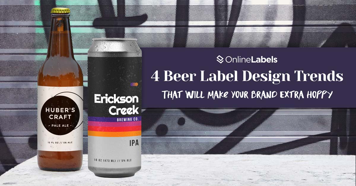
Four Beer Label Design Trends That Will Make Your Brand Extra Hoppy

Before craft beer became the cool kid on the block, simply being recognized as a craft beer was enough to spark the beer lover’s interest.
With no shortage of craft, seltzer, domestic and imported beer choices on the shelves today, you’ve got to do more than just brew an amazing product. If you want to stand out from the others and even win over those longtime classic beer drinkers, you need to be bold, innovative, and distinctive with your label design.
At one point, most beer bottle labels looked almost identical, only differentiating with logos and colors. Now, you walk down an aisle and see dozens of brews, all different from one another, yearning for the consumer’s attention. If you really want to raise the bar (see what we did there), here are four beer label design trends you should hop on now.
In With the Old
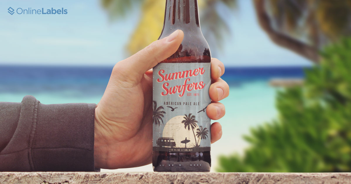
Evoking feelings of nostalgia has been a strategic marketing tactic for decades so this one may not be a surprise. We’ve seen just about every industry jump on the throwback train this year and it’s for good reason. Tapping into those incredible, "good ol’ days" of the past makes consumers feel absolutely giddy and instantly connected to your brand. If they’re too young to remember those times, they still dig the retro and vintage vibes.
Though your label can reflect any time period, we suggest going with the era that is most celebrated as you start to research and design your new beer label. This year, we’ve seen the 60’s and 90’s boogie on back but if another era matches your brand and flavors more, go for that one. It could also totally pay off to stand out by choosing a less popular era.
More than Minimalist
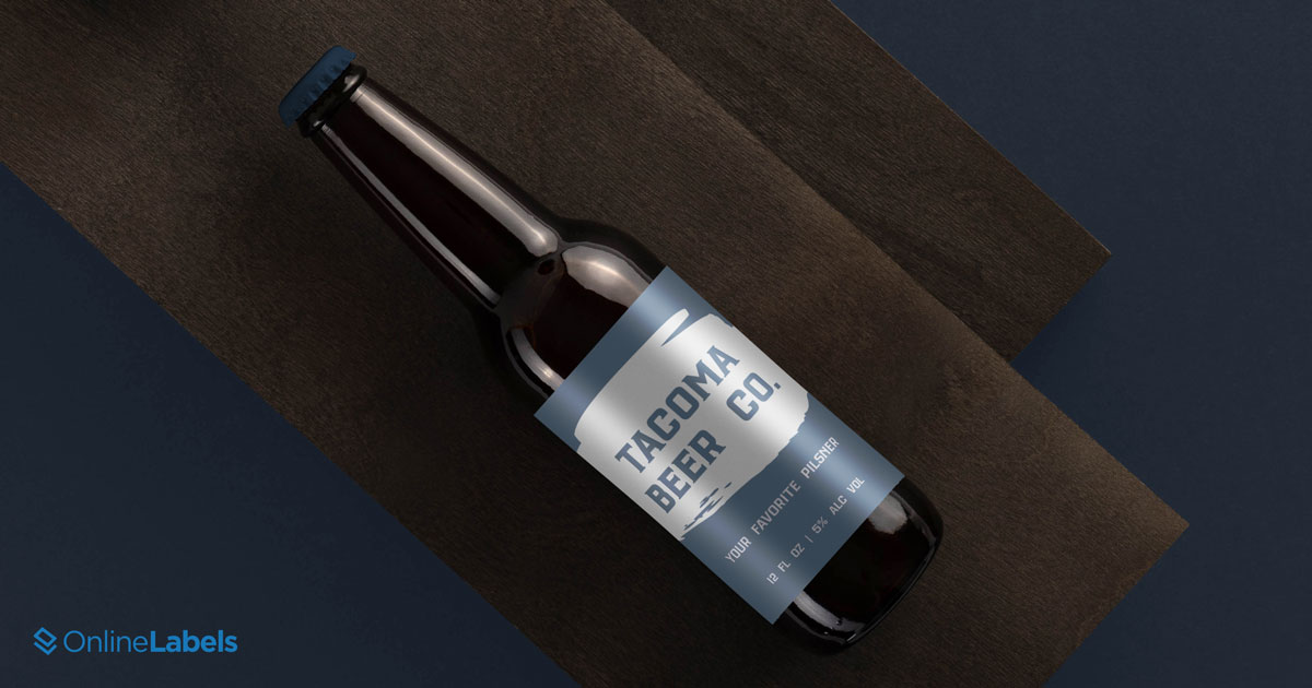
Many will argue that minimalism is overplayed and out but there are so many ways to take it to the next level and stand out if this style matches the sensation and vibe of your brew. Below are a few ways to do so.
- Typography – allows your label to still be simple and clean while adding another dimension and some fun to your design.
- Geometric – We’ve seen brands take to this minimalist approach a number of different ways – multiple shapes, patterns, and colors in a linear format, shapes and patterns in a scrambled format covering all of the white space, and even one large shape taking advantage of the white space. Any approach works as long as it reflects the true identity of your brand.
- Two-tones – Two, contrasting vibrant colors coming together may not seem like anything groundbreaking but we’ve seen just about every industry capitalize on it. Paired with the right typography, your label is way more than minimalist.
- Textures – If simplicity and one color/tone is more your speed, have some fun with raised textures that entice the consumer to want to reach out to the shelf and feel your beer firsthand.
Sustainable and Supportive
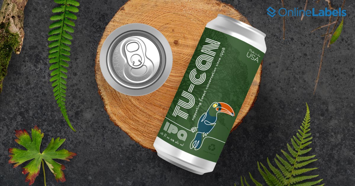
Leading the brewing industry to become a responsible and sustainable industry is Fauna Brewing. Their mission, "brewing goodness for a better planet" is reflected with the story their label tells — the 100% wood-based raw-materials used to make the label. Plus, funds go straight to their three partners who are making a difference in wildlife conservation for endangered species.
If conservation or sustainability isn’t the core or "why" of your brand, you can still pave the way and stand out by using raw materials for your labels, sustainable ingredients for your brew, or using your brand and label to show support to a cause you’re passionate about.
Psychedelic, Baby
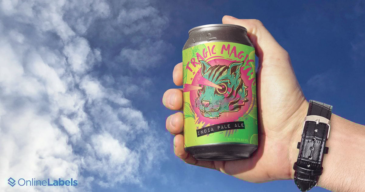
If you have an imagination that runs rampant, a funky brew name, or an out of this world, vivid story you want to bring to life, this one’s for you. Oftentimes, these labels have consumers stopping in the middle of the aisle, completely mesmerized and wondering just how many brews the designer had when they came up with it. Many of these designs take the trippy, hallucinogenic approach and make you wonder if drinking it will teleport you to another planet.
Holographic labels are perfect for this style — plus, your beer will certainly stad out on any shelf.
Before Choosing a Style…
…you need to ask yourself a few questions.
Always first and foremost, who is your target consumer? You probably don’t just have one type of consumer in mind. If you haven’t already, we recommend creating buyer personas for each of your different ideal customers. Understanding who you’re speaking to can't ever be overlooked and will make the decision easier when deciding which design trend might be right for your brew.
What story do you want to tell? This can be as simple as what inspired you to start brewing. A big brewing company you are probably familiar with that has a sweet story is Kona Brewing Co. Everything about the brand is consistent and true to Hawaii, especially the label, which tells a story in itself. Make sure your design aligns well with your brand story.
How do you want to make the consumer feel? It goes without saying that you want them to feel good, especially after that first sip, but what other emotion do you want them to feel? Nostalgic? Sophisticated? Relaxed? Playful?
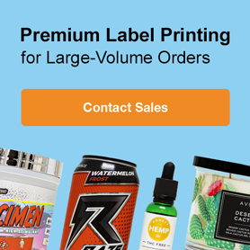
Ready to work on your beer label design? There are a ton of programs available online so you can start creating your own unique beer labels. OnlineLabels has beer bottle label templates (that can all be edited and personalized), materials, and beer bottle labels to get you started.
When you’re hoppy with your design, you can have your beer bottle labels professionally printed by us with custom beer bottle labels.
Or, do you need printed craft beer labels for a large scale order? Shop our enterprise solutions custom craft beer labels today.